
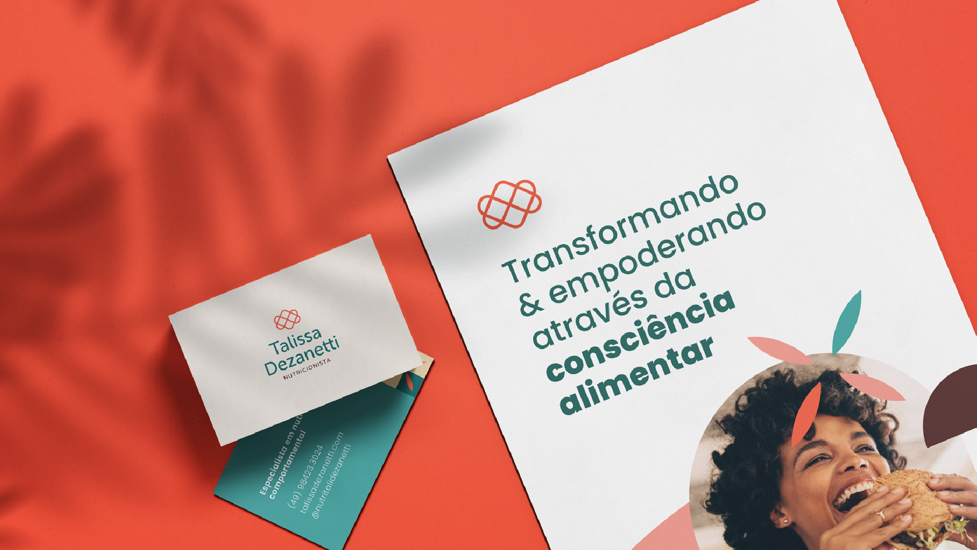
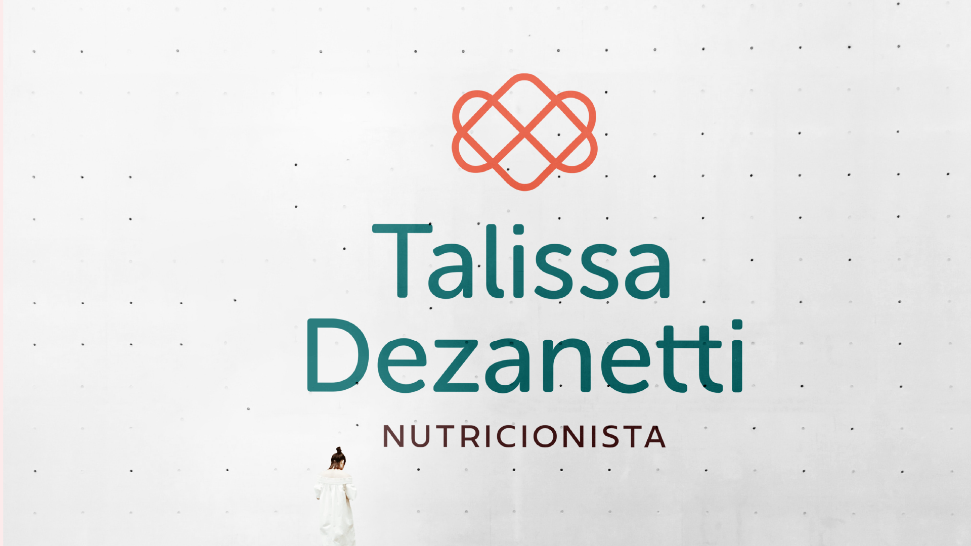
In a minimalist, light and abstract way, we seek to convey in the logo:
- The process and continuity of having a more balanced lifestyle
- The union between the patient and the nutritionist
- The involvement that the professional has with her patients
- The transformation caused after the food re-education process
- Love, which moves the world and also moves Talissa's work
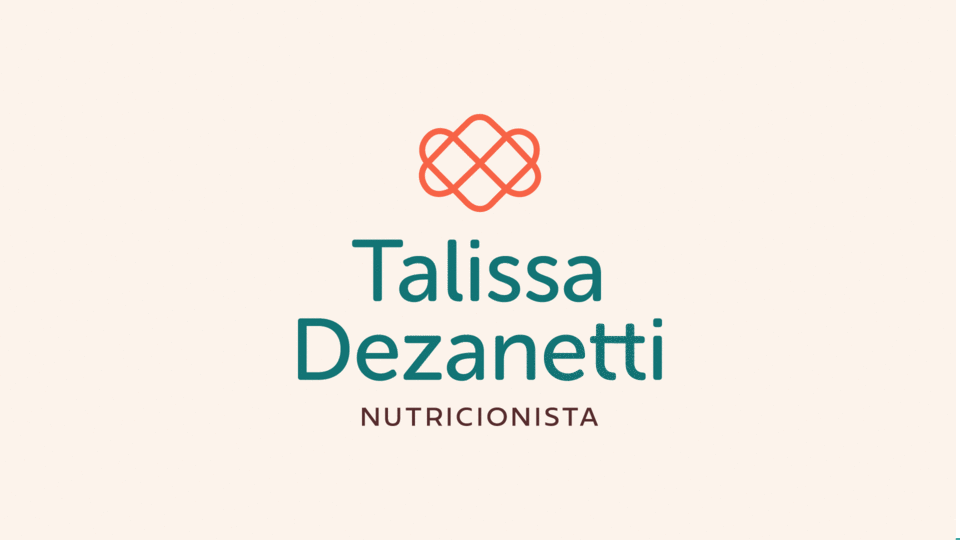
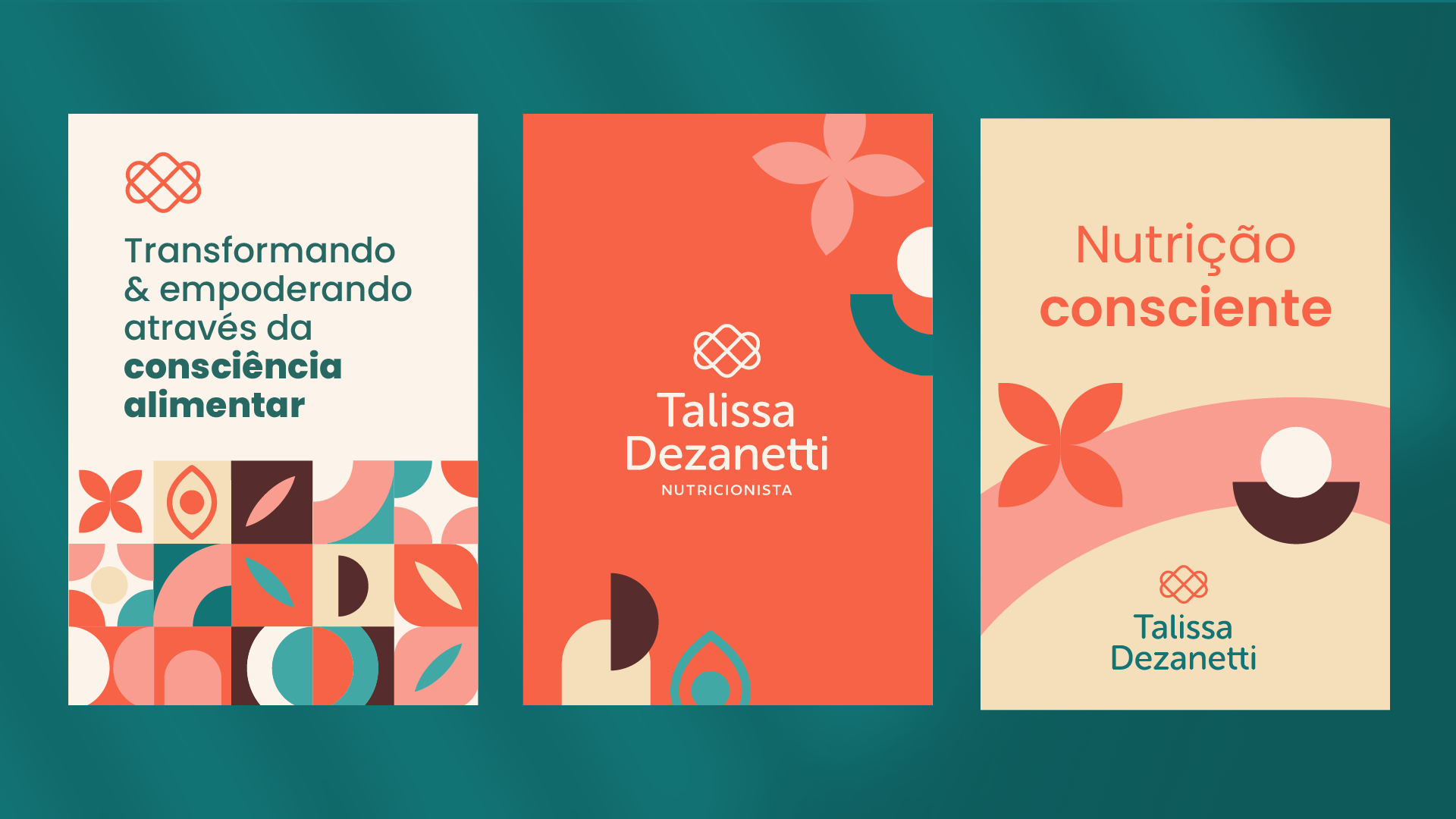
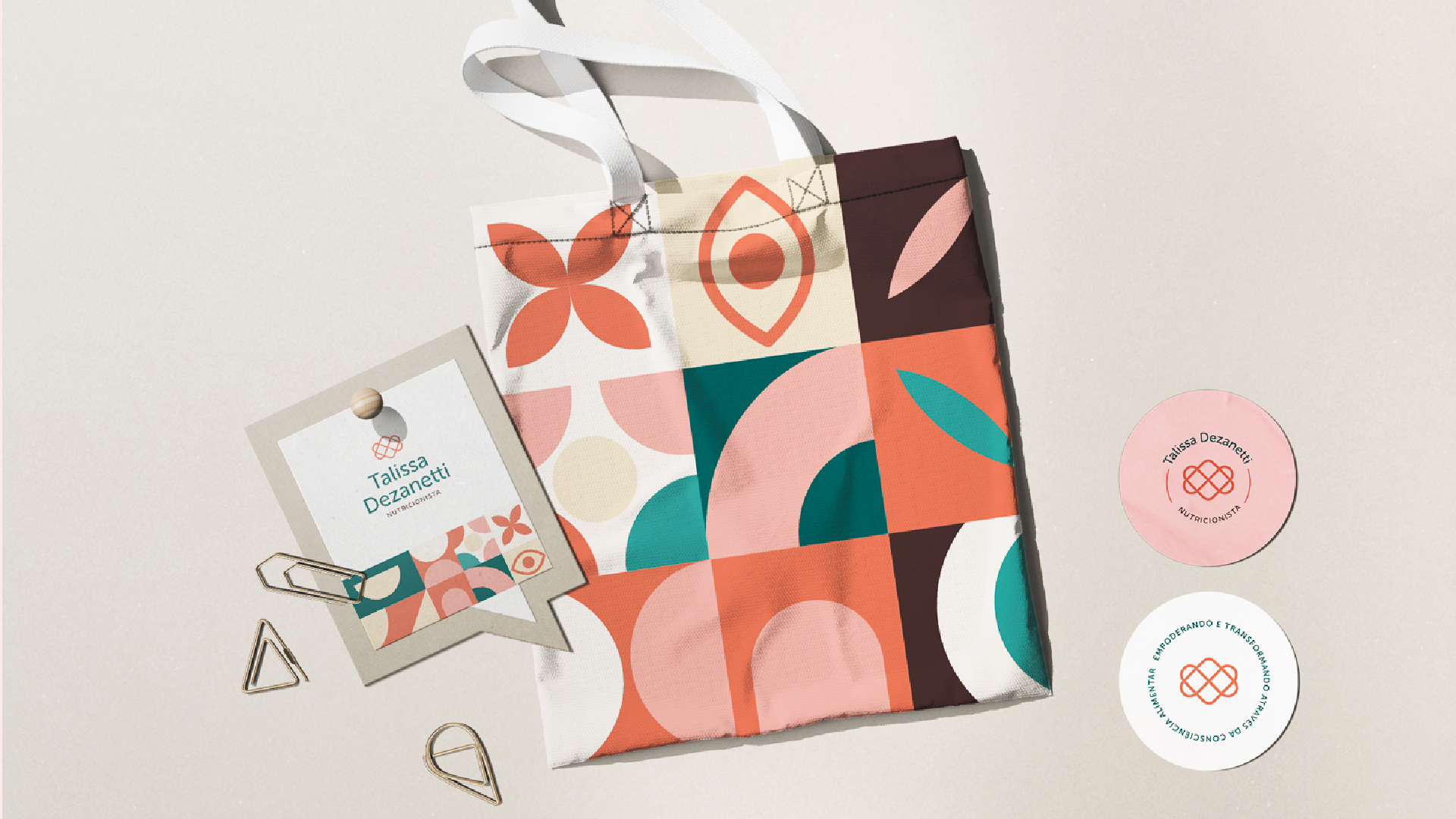
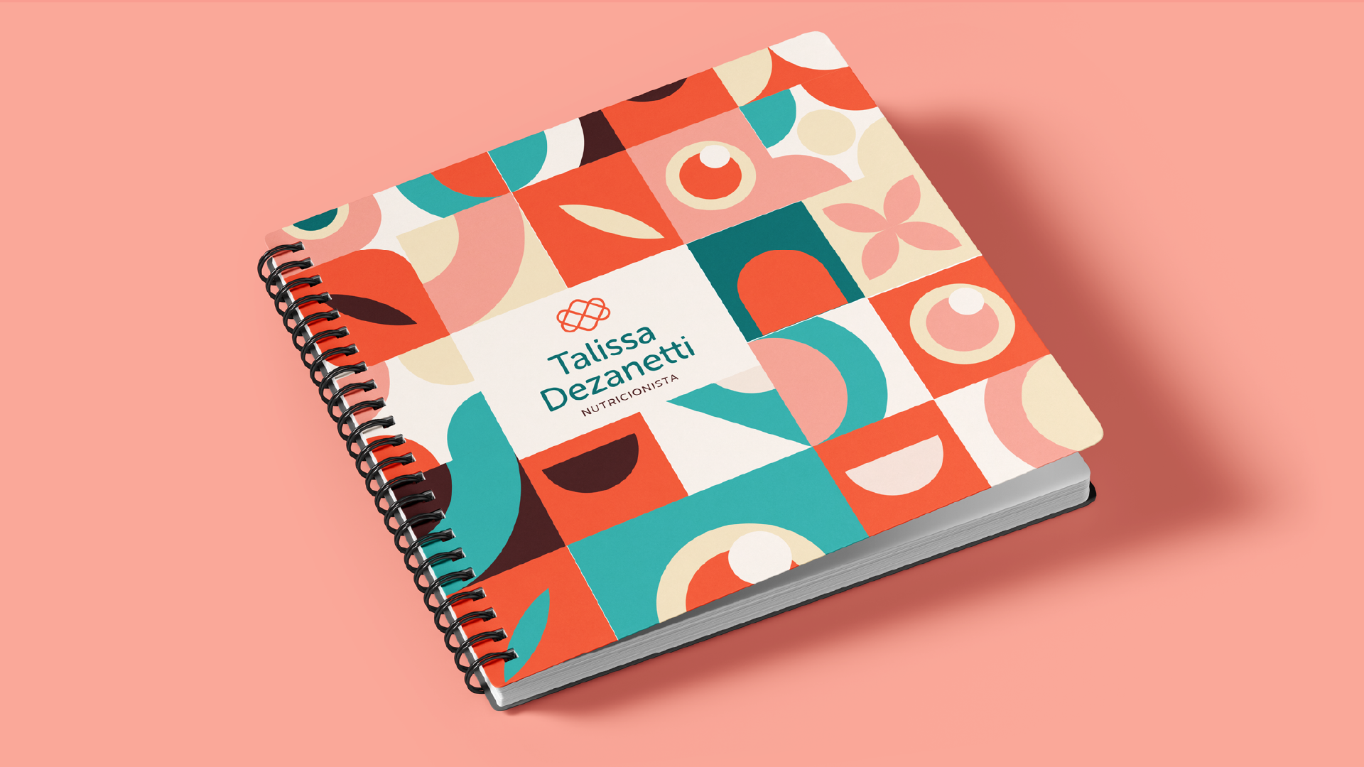
The chosen colors add a cheerful, extroverted, light and cozy atmosphere that connects directly with the target audience.
The orange it is the color of joy, warmth, energy and transformation.
Dark green, on the other hand, promotes calm, balance, freshness, well-being, health and serenity.
Brown brings balance, referring to the earth, organic, healthy.
The beige tone brings warmth and makes the combination of colors even more harmonious and pleasant.

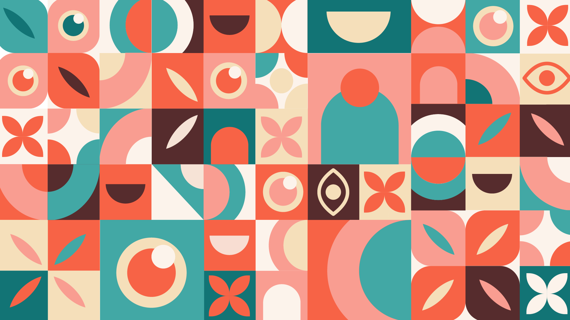
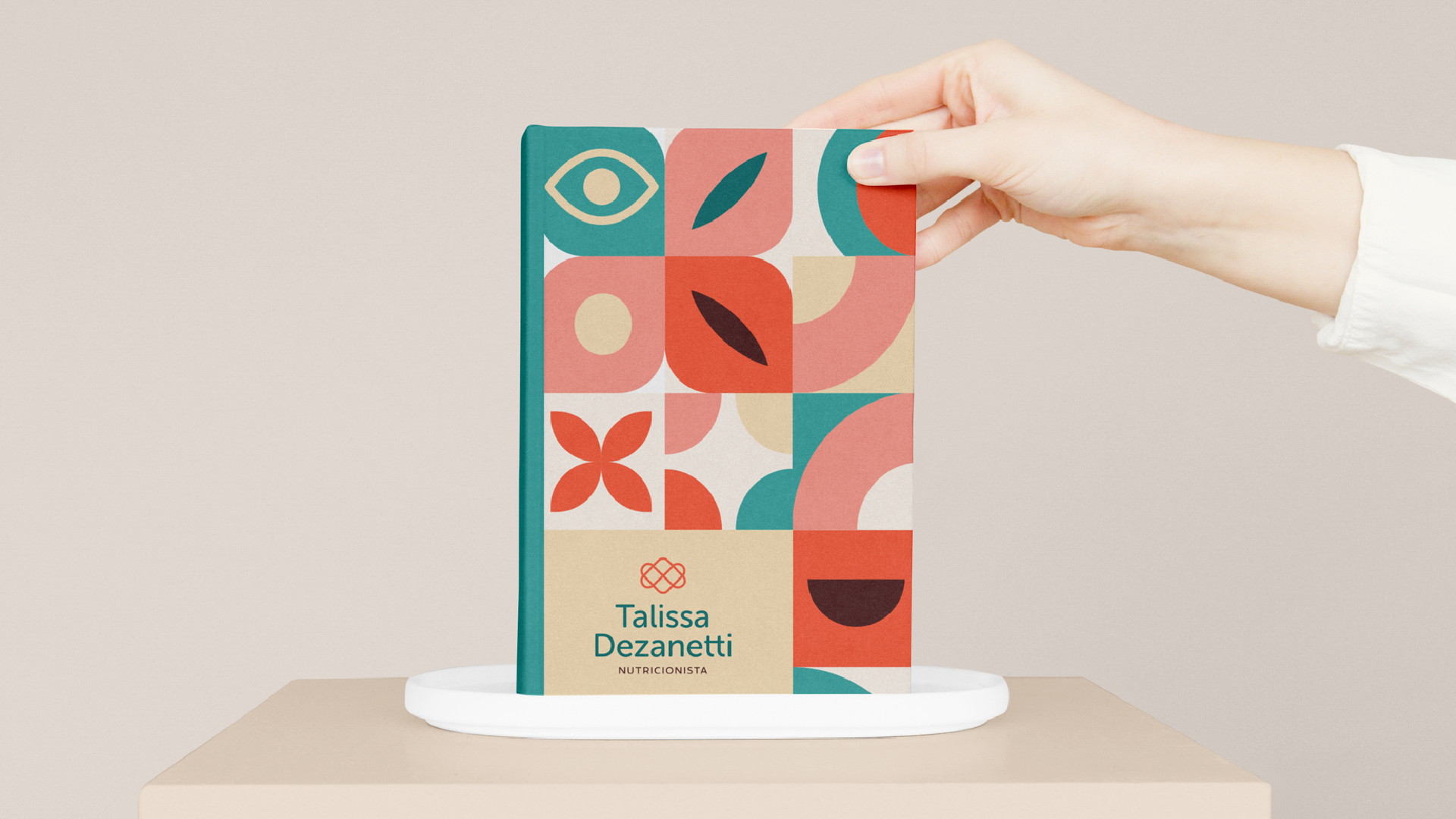
The geometric pattern brings a fun, cheerful and warm touch to a brand. We seek to convey, in the elements:
- Talissa's differentiated vision at nutrition
- The patient's smile of satisfaction
- The door that opens for changes and new possibilities
- A flower, symbol of nature, life, well-being, food, energy
- Transformation, connection, involvement, movement


Thanks